
 Explore Worlds
 Find Life
 Defend Earth
A journey to Jupiter: Amateur astronomers create 1,000-image video of planet in motion

Written by
Peter Rosén
Project Initiator, Voyager 3 Project and "A Journey to Jupiter"
May 9, 2017
This animation of Jupiter is made from more than 1,000 images taken by 91 amateurs from around the world between the 19th of December 2014 and the 31st of March 2015.
For us amateur astronomers, and even the pros for that matter, Jupiter is one of the most dynamic and thrilling objects we can observe, as it displays a rather fast variation in its visible surface structures. Being also a relatively big and bright object in the night sky, it is equally within the reach for amateurs observing under clear skies as for some of us within light polluted cities.
Almost three years ago, I wrote about the “Voyager 3 Project” as a guest blogger here at the Planetary Society. I described how I managed to animate our own backyard telescope images of Jupiter, showing the continuous evolution of its cloud belts and even flybys from a virtual probe that we named “Voyager 3.”
I have been observing and photographing Jupiter on and off since 1973, so it gave me a sense of magic to see the cloud belts come alive and swirl around the planet. It also improved my understanding of how the belts, zones, the Great Red Spot (GRS) and all the other features evolve and interact over a period of time in a way that still images cannot show, unless you are a specialist. The only comparable animations that exist are from the probes Voyager in 1979 and Cassini in 2000, and they are of much shorter periods, so I think making animations can be a new and very useful tool for analyzing and understanding the perturbations in Jupiter's atmosphere.
“Voyager 3” proved to be the most complex and time-consuming astronomical project I had ever undertaken, with many unexpected problems that had to be solved along the way before the animations played back smoothly. The processing and adjustments of the images, their stacking and stitching into maps, and the morphing and animations took almost all my free time for a six-month period. After completion, I promised myself that I would think twice before starting such a drawn-out project ever again!
Yet, I am inquisitive and the spell of Jupiter is strong. I soon found myself pulled into another more ambitious project. One year later, here is the result, a second video titled “A Journey to Jupiter”:
In August of 2014, Anthony Wesley from Australia was invited to the Saturn Science Conference to give a presentation of the current state of high-resolution planetary imaging of Mars, Jupiter, Saturn and Uranus by amateurs. He included our film in the presentation and it got a lot of attention from planetary scientists—among them Glenn Orton from NASA’s Juno mission spacecraft team. Glenn has worked for many years with some of the leading amateur planetary institutions to set up a collaboration between pros and amateurs for the Juno mission, and I was invited to to be part of this project.
Amateurs have made great progress when it comes to high-resolution planetary photography in recent years thanks to their dedication, sophisticated hardware and software but also a big evolution of their technical skills and experience.
So I decided to start a new animation project. This time I planned to use the best images of Jupiter taken by amateurs from around the world, most of which were already uploaded and easily accessible on the world's major dedicated forums like ALPO-Japan and PVOL.
With the help of John Rogers (Director of the Jupiter section at the British Astronomical Association), Ricardo Hueso (PVOL, the Planetary Virtual Observatory and Laboratory), Marc Delcroix (Director of the Planetary Section at the Société Astronomique de France) and Johan Warell (President of the Swedish Amateur Astronomical Society), we contacted some of the best amateur planetary photographers from around the world to get the permission to use their images taken in 2014 and 2015 for this project.
Jupiter rotates in just less than 10 hours, which is quite fast. For any given position on earth, an observer might take pictures of good quality for a total of three to four hours per night when it is high in the sky. All in all, they will show a good amount of detail on 50 to 70 percent of the planet’s total surface. Weather conditions permitting, it is possible to cover the remainder of the surface the following night as Jupiter has rotated two-and-a-half times during that period.
But, if the astronomer misses this opportunity, it might take four or more days to get complete coverage of the surface, and many features will have evolved quite a lot during that period. This makes it difficult to correctly piece the images together. The main weakness of the “Voyager 3” project was that we were all in the same geographical spot, so when we got two weeks of bad weather it almost put an end to our project. By using morphing techniques I was eventually able to fill in the gaps in the timeline and solve the problem.
For this new project, we had the participation of 91 planetary photographers representing 22 countries from all around the world, contributing more than 1,000 images for the period between the 19th of December 2014 and the 31st of March 2015.
With such an extensive network, Jupiter would, at least theoretically, be visible at all times and we should be able to get some images for every rotation, which would make for smooth transitions without having to resort to morphing. This was highly optimistic, of course, and in reality I was able to put together a high definition map for every second day on average, which corresponds to five rotations of Jupiter.
After collecting the images, I had to rename them so they would conform to a standard format with the exact date and time. I then sent them to Johan Warell and Christoffer Svenske, who transformed each image into a cylindrical projections using the free software Winjupos. It can be compared to a world atlas showing a flat representation of our earth.
Upon receiving these projections back, I arranged them in chronological order and introduced date separations representing the transit time of the Great Red Spot. In this way I had a very precise visual feedback of which images composed every rotation of Jupiter.

In the next figure, I have used four images taken by Tizziano Olivetti and Damian Peach, represented to the left. The corresponding cylindrical projections are to the right. As Jupiter rotates, the cylindrical maps display as a translation along the horizontal axis. Note how the GRS, for example, is projected at the exact same longitude in the maps 3 and 4. There is also a certain amount of overlap between the four maps, and when stitched together, they will add up and cover the full 360° as shown in the bottom map. When the images are of very high quality as illustrated in this example, four images are enough to make a complete map. Unfortunately, most of the time we are subject to turbulence and other less than optimal weather conditions so the pictures may have great variations in definition, color, luminosity and contrast. There may also be geometrical distortions induced by errors in the Winjupos process—for example if the timing of the image is somewhat wrong or if the limb of the planet is too dark to be easily identified. So there was a lot of tweaking of the images to give them a similar look and correct geometry before they could be stacked and stitched together seamlessly. Most of the time 10 to 15 or even more images were needed for this operation.

After several months of processing and adjustments I had managed to produce 54 complete maps whose quality greatly exceeded my expectations. The belts and zones showed a great amount of fine structures. The GRS and Oval BA (Red Spot Junior) displayed many internal details that could be traced over time as well as the standing wave structure of the North Equatorial Belts upper side, the bluish “STB Ghost” (STB stands for “South Temperature Belt”) that seems to act as a railroad switch for the flows in the STB and the SSTB (South South Temperature Belt), or the string of white anticyclones in the SSTB.
From these maps I also produced polar views which are centered on the respective poles. Even these remote areas that are usually difficult to image because of the shallow angle of view when observed from earth display a wealth of detail. The polar projections are a little special as I have made them stretch from pole to pole, not just from pole (center) to equator (outside) as traditionally represented. The reason is that I find it more interesting to be able to follow the movements of all the cloud belts regardless of the projection.


In total, I ended up with 54 maps—three times more than the 18 I was able to put together for our previous project, “Voyager 3.” This clearly shows the advantage of a worldwide collaboration for this kind of project. The total period is about 100 days, but at a frame rate of 25 images per second, the 54 maps only represent an animation of just over 2 seconds which is too fast to get a good perception of the motions in the cloud belts. One solution would have been to slow down the playback rate to half speed, but it would appear less fluid so I had to find another solution.
In “Voyager 3” the maps were much less detailed, so morphing proved to work quite well. But for this new project I did not want to resort to the same techniques considering the amount of details that would have to be painstakingly tracked through the 54 maps. I finally opted for a simpler method of interpolation, producing an in-between image for each pair of maps. That greatly improved the fluidity of the animation by extending the duration to 4.3 seconds. The cloud belts still evolve at an accelerated speed of about 2 million times!
At this stage it is possible to take the animations to a higher level. By remapping the cylindrical projections on an ellipsoid, it is possible to visualize Jupiter from any direction in space.
In the opening scene of the video I have even freely simulated the approach of Juno and a flyby over Jupiter's north pole. The image below simulates 3 views of Jupiter normally only possible to record through a camera onboard of a probe like Juno—but these images are taken from our own ground-based telescopes.

I have been asked why the stars or the Galilean moons are not shown. The answer is quite simple: This video is made exclusively from real images taken by amateurs who usually only include the moons close to the limb or in transit over the planetary disc, and the stars are never shown as they would need a longer exposure.
Moreover, the animation being accelerated about 2 million times the normal speed, the moons and star would change position so radically between the frames that they would look more like an erratic swarm of fireflies.
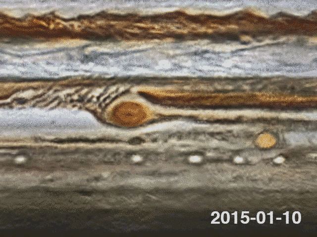
Peculiar activity around the Great Red Spot in January 2015
Contrary to the conditions on earth, Jupiter has no land mass to slow down the storms and cyclones, so they run on completely unobstructed—sometimes for centuries. The zonal wind speeds in Jupiter's atmosphere are quite constant and have been confirmed over time. Even so, there are highs and lows in the activity of the zones, belts or the GRS which can be caused by the emergence of a rift, the outbreak of a cyclone or some other major unbalance. They can last from days to years, but the atmosphere seems to regulate itself and eventually goes back to a more stable and calm appearance. Some of these changes can be quite dramatic, like the disappearance of the South Equatorial Belt (SEB) in 2010, leaving the GRS floating, isolated in a large and mostly featureless white zone for some months.
Some are more subtle, like the change in color of the GRS over time from deep red to orange or a pale pink. Then, there is also the unexplained constant shrinking of the GRS observed for some decades, and the subsequent acceleration of its rotation period, which is down to less than four days.
Except for the emerging technique of taking images of Jupiter in the methane band using a CH4 filter, amateurs can only observe the visible top layers of Jupiter's atmosphere. But many of these perturbations probably have a cause that goes deep beneath its surface and is still waiting to be fully understood and explained.
From the beginning, the project was supposed to run from the 1st of February to the end of March 2015, but early on, the high activity around the GRS got my attention. I decided to extend the animation backwards an additional one-and-a-half months to run from the 19th of December 2014, so I could investigate it further and try to understand the cause of the atmospheric disturbances.
Easily described, the normal flow for the South Equatorial Belt (SEB) is from the right to left and it get squeezed when passing above the GRS but continues its flow on the other side. There is also a secondary flow of recirculation below and around the GRS as illustrated in the next figure.

At the end of December 2014 and in January 2015, the situation around the GRS was very unusual. There was a big dark cloud buildup on the left side of the GRS.
This has been observed on some occasions in the past. What made this occurrence special is that the flow was completely blocked by what I would call some sort of pressure barrier (marked by the double red line). Some investigations showed that the buildup had in fact started back at the beginning of October 2014. Instead of flowing on along the SEB as usual, the obstructed stream was forced back below the GRS where it was caught by the jet streams of the STZ back towards the right in an almost straight dark flow, with almost no recirculation on the GRS right side. The contrast with the previous image is quite striking.

By a happy coincidence Hubble had taken high resolution pictures of Jupiter on two consecutive rotations on the 19th of January 2015 as part of the OPAL program, so I downloaded the maps to use in this analysis.
The first figure below shows a crop of the Hubble maps, and beneath that is the same region from our maps that is the closest match in time. The most noticeable difference is that the tiny light gap in the SEB, just above the GRS, is open in the left image and is getting shut in the short timespan of only 10 hours separating the 2 shots. I have marked the location of this feature by red circles in the second figure.


On the 20th of January, the very day after the Hubble pictures were taken, I noticed in the animation a strong jet of gas that seemed to emanate from the top of the GRS and was thrusted downward on its right side, marked by red arrows in the two consecutive maps below, flowing in the direction from A to B. This direction is the opposite of the usual anti-clockwise flow around the GRS and it is so strong that it disrupts the bands of dark clouds projecting some of them into the South Temperate Belt where they get mixed in the complex wake of Oval BA.
There is a narrow gap in the rim of the GRS at what seems to be the point of origin of this jet, so I don’t exclude the notion that it might emanate from within the GRS itself. In support of this hypothesis is the fact that the coloration of the jet is slightly orange, compared to the surrounding that is more neutral off-white.


As these events might be difficult to notice in the video on YouTube, I have made a crop around the GRS, enhanced the contrast and put it in a loop. I hope this makes it more visible and obvious. At the same time, notice the tiny gap in the SEB that gets closed just prior to this jet.
After this, the barrier slowly recedes to the left and the flow around the GRS goes back to normal.
I would never have noticed this from the still images alone, and to my knowledge it has not been reported previously. In fact I have analyzed 920 images found on ALPO-Japan, showing the GRS from 2012 to 2017, and have not detected a single occurrence of a similar event.
The fluid dynamics on Jupiter are extremely complex and most occur in depth below its visible surface but if it could be observed again and confirmed in the coming years it could possibly be one factor that will help explain the shrinking of the GRS.
It took me a full year to produce this video of Jupiter. To make it both scientifically correct and aesthetically appealing is a lot of labour. I hope it also proves the benefits of an international collaboration for this kind of projects.
During the processing I have discovered several shortcuts that could reduce the production time. With the proper guidelines to the photographers I hope that the process can be significantly simplified making the creation of animations a new tool for visualizing and analyzing the dynamic upper structures of Jupiter’s cloud belts in the future.
Protect Our Shared Future
You help us defend humanity and prevent asteroid impacts. Donate now to become a Planetary Defender!
Donate