Showing off Saturn's moons

Written by
Emily Lakdawalla
February 19, 2008
There was a press release from the Cassini mission today about a pile of papers (14 of them!) being published in the journal Icarus about Saturn's icy moons. I haven't had time to read more than the overview article yet -- I'm still trying to get authors to send me copies of their papers, as Icarus is way out of my price range -- but I wanted to come up with a graphic for an overview of Saturn's moons, and I couldn't resist delving into the massive database of Cassini images to produce something new. (Want to delve into the same database? I've posted all of Cassini's medium- to high-resolution images of all of Saturn's moons except Titan.)
I wanted a montage of the moons, but it's not all that easy to produce one, as there are a lot of variables to deal with. You might think the best thing to do would be to go grab the best-quality images available, by which most people mean the highest-resolution images. But it requires a little more thought than that. If you slap any two images together in a montage, the combination may not look all that great. Consider these two Cassini pictures, of Dione on the left and Tethys on the right.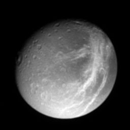
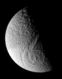
I like these two pictures because they show off the most distinctive features of each world: Dione's "wispy terrain" (now known to be made of a network of fine fractures crossing Dione's darkened leading hemisphere) and Tethys' Ithaca Chasma, a long, backwards-S-shaped chain of canyons that spirals around an unnamed impact basin. However, slapping the two images together like this doesn't look good to me, because the geometry makes no sense. There are two geometric problems. First of all, the moons are lit from different directions, the Tethys one from the lower left and the Dione one from the lower right. That would be easy to repair -- I could just rotate the Dione photo so it seems to be lit from the lower left. But even if I did that, there would still be another problem: the Tethys image is lit almost exactly from the side -- if you saw it the sky, you'd say "there's a half moon" -- while Dione is lit more fully, appearing in a gibbous phase. I can't fix this difference in "phase angle" -- the angle from Sun, to the moon, to Cassini -- through any manipulation of the image.
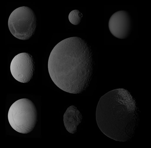
So I resolved to go into the Cassini image database and try to make myself a montage where the moons were viewed at more or less constant phase. Now, Cassini has been at Saturn for almost three years but it hasn't photographed every single moon at every possible phase angle. Also, Cassini doesn't always get all the pictures necessary to make color views, so I decided to stick with black-and-white images only. After some fiddling around I figured out that I could get images of every moon larger than Phoebe within a range of phase angles from 43 to 53 degrees. (Phoebe was only observed from "half-moon" style phase angles of around 85 degrees, higher than I wanted for my montage.) I rotated them all so that the Sun appeared to be illuminating them from the left, and pasted them all together into one image:
NASA / JPL / SSI
Saturn's Moons
These photos of Saturn's eight largest moons were taken at different times by the Cassini spacecraft at a variety of different distances but at nearly constant phase angle (lighting direction) of between 43 and 53 degrees. The moons are: top row: Dione, Mimas, Titan; middle row: Tethys, Rhea; bottom row: Enceladus, Hyperion, Iapetus.Viewed at constant phase angle, it's easier to compare the moons to each other. One thing you should immediately notice is that the moons appear to vary in brightness. Enceladus, at bottom left, is almost blindingly bright; Tethys, above it, nearly as bright; Dione, Mimas, Rhea, and Titan are intermediate; Hyperion and Iapetus are much darker. These appearances reflect reality, as I'm dealing with calibrated data here, except for Iapetus (for that one, I took the imaging team's mosaic from the JPL website and darkened it; it probably should be even darker).
But this image still bugs me, and here's why. The moons vary in size, which, of course, reflects reality -- for example, Mimas (top center) and Rhea (center) appear at just about correct relative size, with Rhea being about four times Mimas' diameter. But Titan should be more than three times the size of Rhea -- what gives? The problem with just slapping the moons together into a montage is that Cassini takes its images at a wide variety of distances from the moons, and its camera doesn't have a zoom lens, so how big a moon looks to Cassini depends upon how far away Cassini was when it took the picture. The closer Cassini is to a target, the higher-resolution photo it takes. The images of Rhea, Iapetus, and Mimas were all taken at pretty similar distances (from roughly 200,000 kilometers away), so they are pretty close to correct size relative to each other, but the images of Enceladus and Hyperion were taken almost twice as close, while the image of Titan was taken from almost eight times further away. That shortchanges massive Titan, and lumpy Hyperion looks really odd when it's the same size as the more spherical, larger moons.
Let's see what happens to the montage when we scale all the images to match the correct relative sizes. I'll keep Rhea, in the middle, at constant size, and scale all the other images up or down to match:

Now that's more like it. With all the moons at the same orientation and phase angle, it's easier for me to compare and contrast them. For instance, you can see that lumpiness tends to decrease with size, except for two very notable exceptions: Enceladus is much much smoother than you would expect for a body its size, while Iapetus is much much lumpier. That basic difference tells you something quite important about what's happening inside the moons -- geologically active Enceladus has enough internal heat that its icy surface has relaxed and smoothed over time, while ancient Iapetus is so cold and rigid that it can maintain huge, steep mountain chains even though it's made of essentially the same materials as Enceladus.
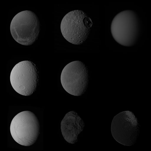
Some people might prefer a different way of assembling a moon collage. Just because one moon is larger than another doesn't make it more important than another, but that's what scaling the images tends to do. In the image above, Titan is rightfully large, but Enceladus, with its active geology, seems tiny and unimportant. Why not scale all the images to the same diameter?
NASA / JPL / SSI
Saturn's Moons
These photos of Saturn's eight largest moons were taken at different times by the Cassini spacecraft at a variety of different distances but at nearly constant phase angle (lighting direction) of between 43 and 53 degrees. The moons are: top row: Dione, Mimas, Titan; middle row: Tethys, Rhea; bottom row: Enceladus, Hyperion, Iapetus.There you have it. Which one do you like best?
If I had more time I'd like to try to go through the same exercise, but with color images; or try different phase angles (I'd particularly love to do a crescent-phase montage). But this effort has taken me all day, and I have several non-blog-related projects that I must move to the front burner -- in fact, working on other projects may keep me from posting anything tomorrow, for which I apologize in advance.
In the meantime, perhaps you can give it a try at home. Again, here's a link to all of Cassini's medium- to high-resolution images of all of Saturn's moons except Titan, which you can browse through at your leisure. Here's a link to a tutorial on making color images. Here's a link to all the pages on this site about each of Saturn's moons, including their diameters. And, if you really want to get your hands dirty, here's a link to a discussion on unmannedspaceflight.com (and two updates here and here) from which you can download a Microsoft Access-formatted database of all the Cassini images released to the public to date; I queried this database to find all my moon images. Have fun!


 Explore Worlds
 Find Life
 Defend Earth