
 Explore Worlds
 Find Life
 Defend Earth


Deep Impact: Pre- and post-impact spectra of Tempel 1
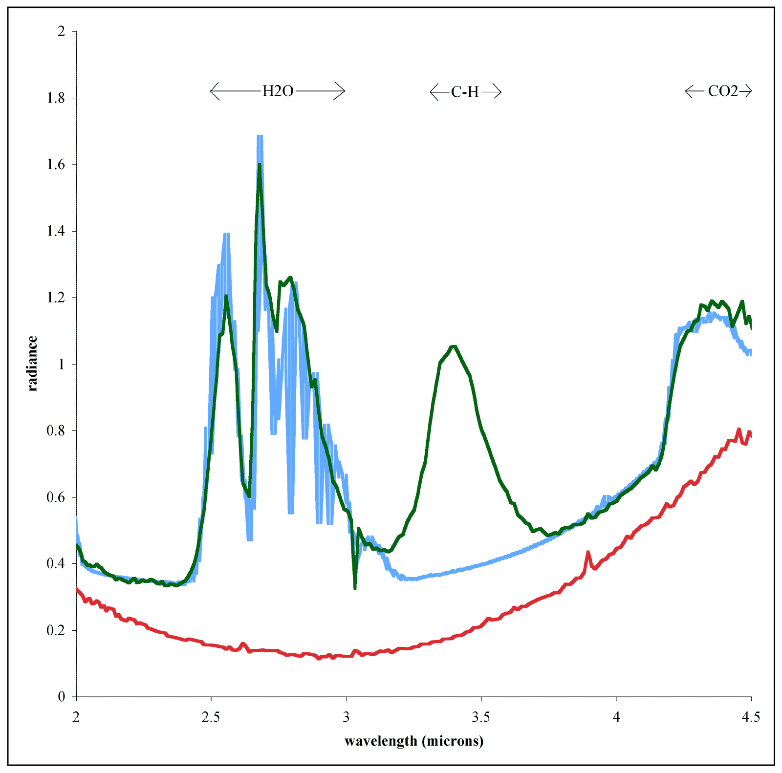
The X axis shows wavelength from 2 to 4.5 microns, all near-infrared. The Y axis is radiance; the higher the peaks, the more photons were measured at that wavelength.
The red line represents the spectrum of comet Tempel 1 taken as Deep Impact approached the comet nucleus. It's very flat with very few features in it. This is typical for bodies that have been sitting in a vacuum exposed to the solar wind for a long time. It's difficult to learn much about a body from a spectrum that looks like that. One thing you may have noticed though is that the spectrum trends "uphill" toward the right. That's because it's essentially a black body, radiating dully in the thermal infrared; this black body thermal radiation would come to a peak somewhere to the right, off of the graph.
To figure out what Tempel 1 was made of, the Deep Impact mission crashed a heavy impactor into it and then looked at it again with its spectrometer. The green line represents the spectrum of the comet and ejecta after the impact. Each peak and valley is a "spectral feature," which a spectroscopist can read like a book. Peaks at certain wavelengths, dips at others, even the shapes of peaks, can identify certain molecules or atoms. The complicated set of peaks and dips between 2.5 and 3 microns is a diagnostic indicator of the presence of water in one form or another in the comet.
The blue line is a first attempt at a "model fit." The "model" consists of a weighted average of spectra of the individual component materials that one would expect to find in the comet.
NASA / JPL-Caltech / UMD