
 Explore Worlds
 Find Life
 Defend Earth
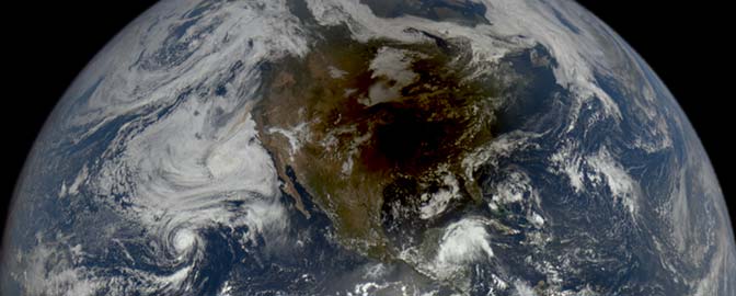

Emily Lakdawalla • Apr 25, 2013
Awesome interactive solar system exploration history infographic
Check out this absolutely wonderful infographic produced by Olaf Frohn that summarizes the entire history of solar system exploration. (He says: "The complete and utter historie of Solar System exploration, let me show you it!") At first glance, it's just a set of bars on a timeline graph, color-coded for mission type. But click on almost anything on the graph and it pops up a ton of useful information. Here's one example:
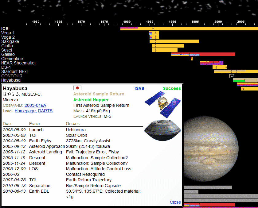
Here's what Olaf says about this project:
I'm a coder by trade; therefore my natural instinct is to automate things. In this case, that means gathering a tremendous amount of data, and since my other natural instinct is to generalize, I soon arrived at the illustration of the whole history of in situ Solar System exploration. Just to make it more challenging, the thing should also be interactive.
That is the overarching plan, anyway. And now, not one year later, this is the first result so far: an interactive timeline presenting all the information I have gathered about planetary exploration missions and their destinations in one handy graphic, or "app" as the kids nowadays call it.
It's still a work in progress, with many features to come, e.g. trajectories (mmmmm, more data...), and more statistics. So if you enjoy it, I always welcome suggestions or helpful pointers to missing information, like where to find trajectories from many early missions, or stuff I missed.
One caveat: the app is coded in HTML5, so it works only in newer browsers, IE9+, Firefox3+, Chrome/Safari3+, Opera10+ etc. If your browser only shows a static image, it is too old.
As for now, have fun exploring...
You guys have seen Olaf Frohn's visualization work on this blog before; he's the one who makes the month-by-month "what's up in the solar system" graphics I post here from time to time. I now keep them all on a single page, so the one you'll see below is the latest graphic I have. It's the one for May 2013 as I write this, but will update automatically as Olaf delivers new ones to me. As of this writing, there are five active Mars spacecraft, five solar observing spacecraft, three at the Moon, five in a variety of other locations (Mercury, Venus, Saturn, and the edge of the solar system), and seven cruising to future destinations.

Let’s Go Beyond The Horizon
Every success in space exploration is the result of the community of space enthusiasts, like you, who believe it is important. You can help usher in the next great era of space exploration with your gift today.
Donate Today