
 Explore Worlds
 Find Life
 Defend Earth
A new look for The Planetary Report
How an iconic magazine gets a makeover
Written by
Aïda Amer
March 10, 2025
If this is your first time receiving The Planetary Report, welcome! If not, you’ll have noticed that things look a little different now. We have welcomed a new duo of talented designers to reenvision the look and feel of our longstanding member magazine. To create this new vision for the magazine, Aïda Amer and Arielle Wilkins, who together form the design agency Ariaï, delved into the Society’s past and learned about our goals for the future. Here are a few words from Aïda about their design inspiration.
The night before Arielle and I presented our very first pitch to work on the redesign of The Planetary Report, we were meticulously building and rebuilding our slides. For days, we had been poring over magazine layouts, typography hierarchies, and NASA image libraries, pulling pieces together to create something sleek and eye-catching without being overly trendy.
Our greatest inspiration, however, ended up coming from, weirdly enough, eBay.
It was just an off chance, but as avid collagers who had bought old magazines before, we thought we might be able to look through some old issues of The Planetary Report for inspiration. Who knew what we might find?
A few clicks and we found them: original prints and covers of the magazine, which would serve as a muse for our new concept, dubbed “The Astronaut’s Almanac.”

Moving from design inspiration to implementation is all about the details. While we have integrated some nods to The Planetary Report’s legacy into the Almanac design, we also wanted to bring a feeling of elevation and modernity.
Combining cyber-futuristic and retro-schematic details, we also aimed to evoke the gravitas of an official report. The cover font, Eurostile, is the original font used in The Planetary Report’s earliest cover design but is supported by the more modern Nexa in the supplementary text. Inside, Nimbus Sans takes center stage as a font that references the width of Eurostile but remains clear and easy to read. Our two interior headline fonts, Jay URW and Megazoid, help create a balance between serious subject matter and topics where we can have a bit of fun. And with bold use of lines and subtle shadow work, we aim to prioritize readability and clarity.
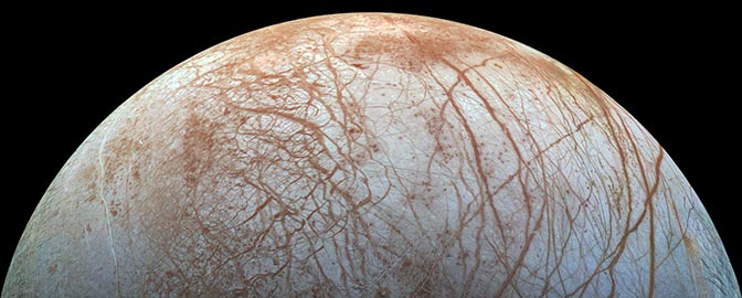
Throughout the design, we’ve implemented small flourishes to pull you into a visual narrative that can only be experienced in the Report. If you look closely, you’ll see them peppered throughout the magazine as small gifts to our fellow space lovers. We introduced elements inspired by science fiction cinema and gaming, like head-up display markers used as reference points for new sections or to draw your attention to images. You’ll also see small minimalist and utilitarian icons inspired by the illustrations on the Voyager Golden Record along the page edges, guiding you through your journey.
All of these touches speak to our love of space. Arielle has six space-themed tattoos at the time of writing (by the time of publication, she may have one more), and I have a too-large collection of books on space and am a hobbyist astrophotographer. (In fact, I took the photo of the night sky that serves as a starfield background on some pages of this issue.)
We designed this magazine for people who love space as much as we do.
We hope you enjoy your journey through this reimagining of The Planetary Report, dear reader. May it bring you closer to the stars.
Protect Our Shared Future
You help us defend humanity and prevent asteroid impacts. Donate now to become a Planetary Defender!
Donate
The Planetary Report • March Equinox
Help advance space science and exploration! Become a member of The Planetary Society and you'll receive the full PDF and print versions of The Planetary Report.