
 Explore Worlds
 Find Life
 Defend Earth
Bruce Murray Space Image Library
Neptune from Voyager
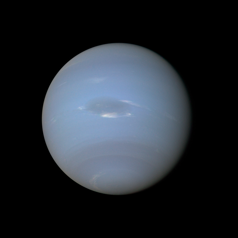
Jónsson describes the processing required to make this as-true-as-possible-color view of Neptune from Voyager data:
I reprojected everything to simple cylindrical projection, aligning the color channels there (i.e. in effect rotating them around Neptune's axis of rotation) and then rendering the map on an ellipsoid without applying any illumination, instead making Neptune self-illuminating.
Following this the limb and terminator didn't have realistic color because the three images were obtained over a period of 18 minutes due to the need to transmit them to Earth in real time. I fixed this by making a "regular" color composite (the features near the center of the disk looked horrible in that one) and then "cloning" the color from the limb and terminator in that version to the rendered image. This combined the best features of both versions of the color composite. This I did using Photoshop. This was followed by fairly extensive manual cleanup
ecause there were still some spurious features present due to noise in the source images. So this is a very heavily processed image.I then altered the color balance a bit by making a synthetic red image; this made the image a bit more blue. This step was necessary because Voyager's vidicon cameras were not sensitive to light beyond orange wavelengths. The final step was to make the bright clouds around the Great Dark Spot a bit more white. These two steps were somewhat arbitrary but using various other images as a guide (Hubble images of both Uranus and Neptune and the Voyager 2 Uranus-Neptune color difference) I think this significantly improved the color balance. I'm pretty sure this is more realistic than most of the "official" images - the blue color must be too strong and saturated in them. Also most of the official images were made from only two source images, often green and clear.
The final step would usually have been to sharpen the images slightly but in this case doing so brings out too much noise in my opinion. It would be an interesting future project to make a 2x2 color mosaic of Neptune but I'm not even sure it's possible due to the long time it took to acquire the required images. So making a high resolution global map and rendering that from any angle might be the only way to get higher resolution global "images."