
 Explore Worlds
 Find Life
 Defend Earth
Exposing Io's true colors

Written by
Jason Perry
August 20, 2010
By now readers should know how interested I am in reconstructing views of solar system worlds as they'd appear to human eyes. Color matters more for some worlds than others. Jason Perry posted this entry on reconstructing the "true color" of Jupiter's moon Io on his blog yesterday, and I found it so fascinating and informative that I asked his permission to repost it here. He also just posted a cool entry on yesterday's "shrinking Moon" news story, with commentary on how Saturn's moons are likely expanding, not shrinking. --ESL
Thanks to its active volcanic activity and sulfur-rich surface, Io is one of the most colorful worlds yet seen in the Solar System, save the Earth of course. Publicly released images of Io from the Voyager and Galileo missions show a variety of colors on Io from reds surrounding Pele and Tvashtar, to yellow cyclo-sulfur and gray-white sulfur dioxide frost. Greens and red-browns crop up across Io's mid-latitudes and polar regions, respectively, either from sulfur impurities or radiation damage. However, the colors seen on most images of Io available on the internet use exaggerated colors (example), either from the use of filters that pick up light at wavelengths that are invisible to the human eye (example) or by stretching the image to emphasize color differences from region to region (example). Both are quite useful for science as they reveal regional compositional differences that might not be apparent to the naked eye.
On my blog and on my Io image website, I have processed Galileo images with limited amounts of color exaggeration added, creating true color images of Io. I have done this by ensuring that the three images that make up each color composite use filters that allow photons in the visible spectrum to reach the camera's CCD (red, green, and violet) and by stretching each image in the color composite the same way. For the latter, this means that each of the three images (per frame if it is a color mosaic) was calibrated so that the pixel values were equal to the intensity of detected photons divided by the incoming flux from the Sun (a value referred to as "I/F") at each effective wavelength. When I converted the data to a tiff format image (for editing in Photoshop), I linearly stretched each of the three images so that the a pixel value of 0 was equal to the I/F of the black sky and 255 was equal to the maximum I/F seen in the RED filter (the brightest of the three color filters, at least for Io). The image of Io against the clouds of Jupiter below was processed in this manner. As long as the images were properly photometrically calibrated, the resulting color images should be as close to true color as I can get without further manipulation of the images.

Now you may be asking yourself, "What do you mean 'without further manipulation of the images'? Didn't you just say that you were 'creating true color images of Io'?"
As Björn Jónsson points out on his webpage, "Io's color," Galileo and its predecessors, the Voyager space probes, did not carry the necessary filters that would correspond to the Red-Green-Blue color space most commonly used either as channels in Photoshop, as the color space of modern LCD monitors, or the three types of cones in the human eye. Voyager's color filter set included:
- ultraviolet (effective wavelength of 332 nanometers);
- violet (402 nm);
- blue (475 nm);
- green (564 nm); and
- orange (589 nm) filters.
Galileo's color filter set included:
- violet (404 nm);
- green (557 nm);
- and red (663 nm), as well as:
- four narrow-band filters that were sensitive to light at near-infrared wavelengths (734, 756, 887, and 986 nm).

Now for most bodies that are relatively bland in color at visible wavelengths, like most of Saturn's satellites, the differences between an object's appearance in blue and violet filters would be pretty minor, and so it would make little difference if a violet filter image was used in place of a blue filter one for the blue channel. However, Io's albedo [how much light its surface reflects] changes dramatically from a Galileo violet-filter mean of 0.2771 to a green-filter mean of 0.7443. Thus, the filter used for the blue channel is important as Io's average brightness is strongly dependent on the effective wavelength of the filter. Green and red filters for Galileo, Voyager, and Cassini are centered on either side of another ramp in Io's spectrum, and so they are less dependent on effective wavelength. Voyager's lack of a red filter prevented it from detecting the red color of the Pele plume deposits (instead they appear dark or with a dark, red-brown hue in Voyager color composites). With Galileo color composites, having to use a violet filter instead of a blue one for the blue RGB channel gives Io a strong, yellow hue, when it would likely be more muted.

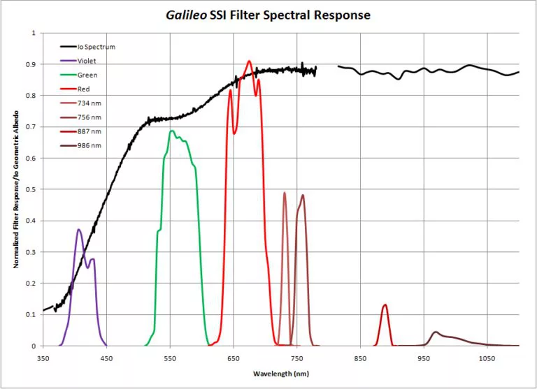
You can see this in the top graphs above. These compare Io's geometric albedo (charted in black in these two graphs) to the spectral responses of color filters used by the narrow-angle camera on Voyager 1 and SSI on Galileo. [The two graphs have different X-axes; Galileo could detect light with much longer wavelengths than Voyager could.] Each colored curve represents the sensitivity of that filter to different wavelengths of light. Both factor in the additional complication of the camera sensor's (CCD for Galileo SSI, vidicon for Voyager ISS-NA) sensitivities. These data were obtained from the calibration reports for the Galileo and Voyager cameras. In the case of the Voyager NAC, both the violet and blue filters are located in the steep spectral slope in Io's geometric albedo. This slope is caused by the absorption of violet and ultraviolet sunlight by sulfur deposits on Io's surface.
In Voyager images, this slope means that there is a steep progression in the average brightness of Io from ultraviolet filter images to green filter ones. For Galileo, the violet filter is located near the bottom of this ramp while the green one is located at the base of another slope that results from reddish material in Io's polar regions and near active volcanic centers like Pele.
So how do we go about generating true color images of Io from Galileo images? First, I should point out that Galileo images are a better choice for synthesizing true color images since while the SSI camera may not have had an optimal filter set, at least it covered the full range of the visible spectrum, unlike the Voyager camera's vidicon sensor, which prevented it from detecting photons beyond 650 nm, cutting off a sizable portion of the red part of the spectrum. As I said earlier, Björn Jónsson has worked on this problem, and created a method of synthesizing a blue filter by mixing the violet and green filter images. He focused on recreating the overall appearance of Io as seen in blue filter Voyager images. When combining this synthesized blue filter images with the normal red and green filter images, he hoped to create a data set that approximated Io's appearance as it would appear to the human eye. He found that the best results came when blue channel pixel values could approximated as:
While this method seems to produce appropriate results, I am a bit concerned about using the Voyager blue filter for the blue channel. Voyager used a blue filter that I feel was a bit too green and was closer to being a cyan filter. [Compare the filter responses to the third graph, which shows the response of the human light-sensitive retinal cells to light.] Remember just because it is called a "blue" filter doesn't make it so :-) So, what I've done instead is try to synthesize blue (BL1) filter images from Cassini, which is part of the true-color set of filters on the ISS camera system (BL1-GRN-RED). The BL1 filter has an effective wavelength of 455 nm, a bit shorter than Voyager's blue filter. This would better approximate the blue end of the CIE color chart. I used the following equation to mix a percentage of the green and violet filter pixel values to create a synthetic BL1 filter image:
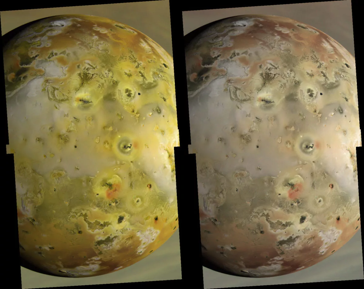
These factors were calculated by finding Io's average geometric albedo at 455 nm (effective wavelength of the Cassini ISS BL1 filter), 404 nm (wavelength for the Galileo violet filter), and 557 nm (wavelength for the Galileo green filter) using ground-based spectral data published by Spencer et al. in 1995 (their data was also used for the Io spectrum in the graphs above). Then, I determined the weighted average between Io's albedo at 404 nm and 557 nm that would equal its albedo at 455 nm. The image below shows the same global color image from March 29, 1998: the version on the left is the original, unstretched version, and the one on the right has had this correction factor applied to its blue channel. The version on the right should approximate a true-color image. Instead of a vivid yellow world, Io appears more subdued, and many white-gray regions on Io appear more pinkish than they did before.
I know I have gone on long enough with this article, but I want to point out a few caveats, just as Björn did. Keep in mind that Io's surface materials have different spectra at visible wavelengths. While most have steep spectral slopes between 350 and 500 nm resulting from sulfur before shallowing through the rest of the spectrum detectable by Galileo's camera, for red materials this steep slope continues on to around 750 nm before shallowing. So the appearance of Io's reddish material would depend on the effective wavelength of the filter used for the red channel. Both the Cassini and Galileo red filters are on the long side of the effective wavelength used for the red channel on most computer LCD's and the red cone in the human retina. This makes reddish materials appear more vivid than they would in real-life, though not quite as muted as seen in Voyager color composites since the human eye is sensitive to longer wavelengths than the Voyager Orange filter even if its effective wavelength is closer to that of your red cones than the red filter on Cassini or Galileo.
Creating color composite images from spacecraft data is almost as much an art as science, and how you create them can depend on the image processor's preferences and the purpose of the processing. I tend to prefer not to enhance the data anymore than necessary, and try to stay true to the original data, even if it isn't exactly true color. That said, it has been an interesting journey into trying to create a "true" color Io image. I may have to post a few more examples using the above formula. I also realized that creating "true" color images may be affected by the conversions of the original DN values of the Galileo raw data to I/F (intensity over flux), so stay tuned on this.
References
Spencer, J.; et al. (1995). "Charge-coupled device spectra of the Galilean satellites: Molecular oxygen on Ganymede". Journal of Geophysical Research 100 (E9): 19,049-19,056.
Spencer, J.; et al. (1996). "Io on the Eve of the Galileo Mission". Annu. Rev. Earth Planet. Sci. 24: 125-190.
Geissler, P.; et al. (1999). "Global Color Variations on Io". Icarus 140: 265-282.
Protect Our Shared Future
You help us defend humanity and prevent asteroid impacts. Donate now to become a Planetary Defender!
Donate