
 Explore Worlds
 Find Life
 Defend Earth

Planetary Society Advent Calendar for December 18: Neptune
Written by
Emily Lakdawalla
December 18, 2009
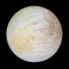
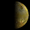
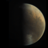
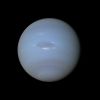
Here's Neptune, but not quite like you've ever seen it before. Press-released Voyager 2 images of the planet show a world whose atmosphere is as deep a blue as Earth's oceans. But if you've ever looked at Neptune through a telescope (something that I'm sad to admit I've not done) you won't see that color; you'll see, well, a pale blue dot. Hubble images (the ones that aren't false color) show the same thing.

Björn Jónsson created this Neptune image through pretty much the same steps he used to make the glorious Voyager 2 Jupiter portrait I posted earlier. Bjorn describes the processing much better than I could, so I'm letting him do the talking:
I reprojected everything to simple cylindrical projection, aligning the color channels there (i.e. in effect rotating them around Neptune's axis of rotation) and then rendering the map on an ellipsoid without applying any illumination, instead making Neptune self-illuminating.
Following this the limb and terminator didn't have realistic color because the three images were obtained over a period of 18 minutes due to the need to transmit them to Earth in real time. I fixed this by making a "regular" color composite (the features near the center of the disk looked horrible in that one) and then "cloning" the color from the limb and terminator in that version to the rendered image. This combined the best features of both versions of the color composite. This I did using Photoshop. This was followed by fairly extensive manual cleanup because there were still some spurious features present due to noise in the source images. So this is a very heavily processed image.
I then altered the color balance a bit by making a synthetic red image; this made the image a bit more blue. [This step was necessary because Voyager's vidicon cameras were not sensitive to light beyond orange wavelengths. --ESL] The final step was to make the bright clouds around the Great Dark Spot a bit more white. These two steps were somewhat arbitrary but using various other images as a guide (Hubble images of both Uranus and Neptune and the Voyager 2 Uranus-Neptune color difference) I think this significantly improved the color balance. I'm pretty sure this is more realistic than most of the "official" images - the blue color must be too strong and saturated in them. Also most of the official images were made from only two source images, often green and clear.
The final step would usually have been to sharpen the images slightly but in this case doing so brings out too much noise in my opinion. It would be an interesting future project to make a 2x2 color mosaic of Neptune but I'm not even sure it's possible due to the long time it took to acquire the required images. So making a high resolution global map and rendering that from any angle might be the only way to get higher resolution global "images."
I'll note that this particular kind of work is something that Bjorn is especially skilled at, so I hope to see some more! I was very surprised that the Great Dark Spot, the southern circumpolar cloud band, and the limb turned out so gray, and I commented so to him. He replied:
Actually the Great Dark Spot isn't gray -- that's an optical illusion due to the stronger blue color around it. It really is bluish as can be seen by looking at the RGB values -- the color just isn't very saturated. The same thing applies to the circumpolar band
He, too, was a bit surprised by the gray-ness of the limb, but he rechecked his processing and confirmed that it wasn't an error. That doesn't necessarily mean it's real; but he is pretty sure the image is, at least, more realistic in color than most (or even all) of the officially released images.
I'm very thankful to Bjorn for providing me with this new view of Neptune from data more than twenty years old!
Each day in December I'm posting a new global shot of a solar system body, processed by an amateur. Go to the blog homepage to open the most recent door in the planetary advent calendar!
Protect Our Shared Future
You help us defend humanity and prevent asteroid impacts. Donate now to become a Planetary Defender!
Donate