
 Explore Worlds
 Find Life
 Defend Earth
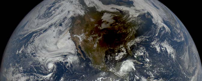

Jason Davis • Oct 09, 2014
JPL Releases a Big, Bold Website Redesign
This week, NASA's Jet Propulsion Laboratory released a major website overhaul. It's a substantial departure from their old site, and features a responsive, immersive design. By responsive, we're talking about sites that dynamically rearrange themselves to be readable on a variety of screen sizes, from phones to desktop computers. And by immersive, we mean the design is minimalistic and features big, bold multimedia elements that direct the viewer's focus solely on the content—in this case, "some of the coolest videos, images and news stories in the Universe," says a narrator in the site's introductory video.

Overall, I'm a fan. I appreciate that a major NASA center took a step outside the status quo to embrace modern web design. I also like that an effort was made to make the site accessible to both casual browsers and regular visitors. For instance, someone drawn to the site through a social media link might soon find themselves exploring full-screen image galleries, gawking at the core of a dead star or the tracks of a one-ton Martian rover. At the same time, it's pretty easy to find media resources like press kits and links to mission-specific websites.
The page opens with full-screen images linking to news stories, images and other content. Well, not quite full-screen—you'll notice the designers included a "scroll for more" break at the bottom of the page. That's likely because some users find full-screen web images disorienting to the point of not realizing that the page is scrollable. We received similar feedback during previews of The Planetary Society's soon-to-be-released LightSail website, so we added an animated arrow to guide viewers down the page.
Immersive websites work best when you feature compelling multimedia to accompany well-written stories. It won't be hard for JPL to find pretty pictures—a giant image of Saturn's mesmorizing polar vortex, for instance, works very well here. But there's a pitfall: The cover images have to be centered so that their focus doesn't stray off the page on devices using portrait orientation. Take, for instance, a recent headline about the NuSTAR spacecraft's discovery of the brightest-ever pulsar. The featured image uses a zoomed circle pullout. But—oh no! On my Nexus 7 tablet, the pullout wanders off the screen. It's not a huge deal, and in fact, it might draw some users to click on the image to learn more. But it's a consideration nonetheless.

As you scroll down the page, you'll notice a lot of the content is presented in block format. This is a staple of responsive design—blocks are easy to dynamically arrange so that they fit snugly on multiple screen sizes. To see what I mean, check out the "What's Happening Now" section. On my Windows PC, I see three items each under the Featured, News, Videos and Images headers, and I can click an arrow to load three new items. On my Nexus 7, I only see two items. And on my phone? Just one. The advantage of using this format is that the content remains snappy and readable, no matter the device.
Next up is the Missions section. I really love the fact that JPL chose to put their missions portal smack-dab in the middle of the page, rather than burying it within dropdown menus. Missions are the bread and butter of both JPL and NASA at large, so it makes sense to emphasize them. Compare JPL's new approach to NASA's existing missions page:

Since JPL has less missions to feature than NASA, it makes sense to categorize them by Current, Past, Future and Proposed. In all fairness, NASA proper has a lot more missions to contend with. They allow you to sort by mission topic, which helps, but there's something dismaying about seeing "Apollo-Soyuz" listed as the fourth mission. I'm pretty sure that whenever I land on this page, my impatient brain decides I'm in the wrong place and commands my finger to click the back arrow.
Most NASA missions have their own websites. Therefore, the new JPL mission pages mostly provide a brief overview, things like press kits and fact sheets, and a link to each mission website. This brings up a complex web design question that is common for any large organization with semi-autonomous subgroups (such as other government agencies, or universities): To unify, or not to unify? Trying to squeeze all of NASA.gov and its dizzying array of subsites into a single, common design would be expensive and time-consuming. And that's just from a technical perspective—I can only imagine the role intra-agency politics would play.
Plus, who among us hasn't enjoyed stumbling upon an ancient, abandoned NASA web page? This deeply buried portion of NASA's history website was invaluable for research I did on the Ranger program for my journalism master's project. And what about treasure troves like this space shuttle mission archive? I hope that if NASA ever begins shutting down old servers like this, they migrate the data for historical purposes.

There's another neat part of the website redesign that's worth mentioning: The innovative use of the menu "hamburger" in the top-right. Clicking it brings up a full-screen menu rather than standard flyouts and dropdowns. I think this part of the site is well-executed, and it puts most sections just a couple clicks away. Personally, I would move the News and Missions sections closer to the top, but this may have been a design choice—notice how the menu is visually organized into an hourglass shape.
I did notice one bug that I hope the web team will address. It's most apparent on mobile devices—in particular, phones. When scrolling through the main page, if my finger starts its scroll motion on certain images (and areas surrounding those images), the page won't scroll. You can't really scroll past the "Explore" section on a phone unless you get a running (flicking?) start.
All in all, JPL's new website is a fitting home for news and multimedia coming from some of the world's flagship space missions. At first glance, you might think immersive web design is jarring or gimmicky. But as the trend continues to gain momentum, the organization of these sites is becoming a priority, rather than an afterthought. JPL's site seems like an effective way to get information-soaked visitors to slow down and focus on content—in this case, content that showcases the beauty of space.
Let’s Go Beyond The Horizon
Every success in space exploration is the result of the community of space enthusiasts, like you, who believe it is important. You can help usher in the next great era of space exploration with your gift today.
Donate Today